
2. Business Data Analytics Domains and Tasks
2.4 Interpret and Report Results
Guide to Business Data Analytics
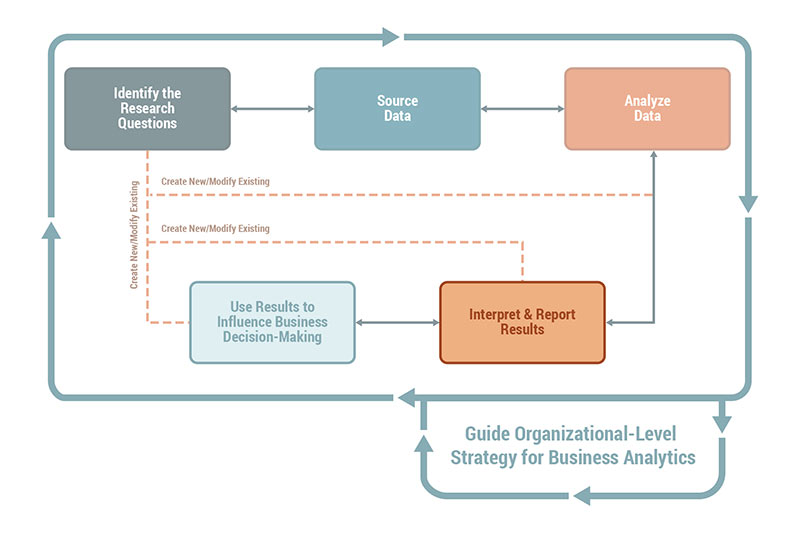
The Interpret and Report Results domain uses the results obtained from data analysis to gain business insights from the data collected and determine how to best communicate and report the outcome from business data analytics to relevant stakeholders.
The term "reporting results" is used in a broad sense to communicate and explain certain facts to an identified audience.
The outputs from Interpret and Report Results are used to influence decision-making. Business insights may differ from the way data patterns are understood and communicated. Where the data patterns and signals focus on trends, distributions, and statistical parameters, business insights are focused on inferring business-relevant facts. To communicate the insights effectively to the stakeholders, analysts use explanatory analysis rather than exploratory analysis.
The Interpret and Report Results domain includes:
- Planning for Communicating the Insights: Who are the stakeholders that require communication of the insights? What are stakeholder perceptions about the subject matter? What is their level of engagement and availability? What is the desired frequency of communication?
- Interpreting Analytics Results: How are data patterns, trends, signals, and models translated to business insights in business language?
- Explaining the Findings: What is the insight that needs to be communicated? What is the best method of communication? What is the right level of detail for each stakeholder? What is the best way to record the results and feedback for future consumption?
Tasks in the Interpret and Report Results domain include:
- Validate Understanding of Stakeholders,
- Plan Stakeholder Communication,
- Determine Communication Needs of Stakeholders,
- Derive Insights from Data, and
- Document and Communicate Findings from Completed Analysis, and
- Select Techniques for Interpret and Reporting Results.
2.4.1 Validate Understanding of Stakeholders
Early in a business data analytics engagement, stakeholders are identified and analyzed to understand how to effectively engage and collaborate with the variety of stakeholders involved. As the engagement evolves, changes to business context, strategy, and personnel occur. As a result, stakeholder analysis is ongoing and continually updated.
The analytics team continually validates the results of stakeholder analysis to help guide their work of interpreting and reporting results. They continually assess:
When validating the results of stakeholder analysis, the team uses techniques such as brainstorming, interviews, process modelling, and reviewing other models such as organizational charts. Models that were used to relate the enterprise strategic goals to the organizational goals and objectives and the stakeholders impacted are reviewed. This gives the team the best opportunity to interpret and report results in a way that will resonate with stakeholders
Early in a business data analytics engagement, stakeholders are identified and analyzed to understand how to effectively engage and collaborate with the variety of stakeholders involved. As the engagement evolves, changes to business context, strategy, and personnel occur. As a result, stakeholder analysis is ongoing and continually updated.
The analytics team continually validates the results of stakeholder analysis to help guide their work of interpreting and reporting results. They continually assess:
- changing needs and objectives,
- the importance of the research questions,
- how quickly the analytics results are expected,
- skill-sets for interpreting those results, and
- levels of education in and experience with analytics.
When validating the results of stakeholder analysis, the team uses techniques such as brainstorming, interviews, process modelling, and reviewing other models such as organizational charts. Models that were used to relate the enterprise strategic goals to the organizational goals and objectives and the stakeholders impacted are reviewed. This gives the team the best opportunity to interpret and report results in a way that will resonate with stakeholders
2.4.2 Plan Stakeholder Communication
Planning stakeholder communication includes identifying what needs to be communicated, to whom it needs to be communicated, how it needs to be communicated, and when it needs to be communicated. Planning stakeholder communication for an analytics initiative is like most other initiative-level communication planning. It requires analysts to know and understand who the stakeholders are and the communication preferences of individual stakeholders and stakeholder groups.
When planning stakeholder communication, analysts consider:
- that stakeholder communications can involve an intermediate or final result since analytics initiatives are inherently iterative.
- the formality and the level of detail may vary amongst stakeholders
- the level of expertise required by stakeholders to interpret analytics results
- the level of privacy and confidentiality to be maintained
- keeping stakeholders informed about the progress and the approaches taken throughout the course of the initiative
- maintaining an appropriate level of communication during the initiative
- recording the responses and feedback from stakeholders for further action and follow-up
2.4.3 Determine Communication Needs of Stakeholders
Determining the communication needs of stakeholders enables customization of communications to individual stakeholders or stakeholder groups so the message is clearly understood.
Understanding the characteristics of stakeholders, an output from stakeholder analysis, provides guidance when planning and determining a communication approach. Stakeholder communication requirements may include stakeholder preferences regarding:
Each stage of the analytics process is communicated in a variety of ways, particularly with regards to the analytics research and experiments that can be quite formal and academic. For example, drug discovery and medical studies impose regulatory formats and structure. Analysts use their understanding of stakeholders to determine how best to communicate.
Descriptive and diagnostic analytics results may generate friction when gaps are identified in the business process between stakeholders. Likewise, predictive and prescriptive analytics may suggest a completely new way of decision-making, prompting stakeholders to resist the changes. Analysts find approaches to make the analytics more accessible through compelling ways of representing analytics results.
When planning stakeholder communication, analysts use a variety of elicitation techniques to identify the communication needs of stakeholders and to define the best approach to share the results from analytics.
Retrospectives or lessons learned identify what methods of communication worked well and what methods could be improved upon. Facilitation and communication skills, along with business acumen, enable the development of a well thought out communication approach.
Determining the communication needs of stakeholders enables customization of communications to individual stakeholders or stakeholder groups so the message is clearly understood.
Understanding the characteristics of stakeholders, an output from stakeholder analysis, provides guidance when planning and determining a communication approach. Stakeholder communication requirements may include stakeholder preferences regarding:
- what information is most relevant to them,
- how they wish to receive information,
- how often they wish to be updated,
- who the decision-makers in the stakeholder groups are,
- what biases they carry, and
- what factors can potentially weaken the analysis (such as contradictory results, analytics approach, data anomalies, stakeholders' impact and influence).
Each stage of the analytics process is communicated in a variety of ways, particularly with regards to the analytics research and experiments that can be quite formal and academic. For example, drug discovery and medical studies impose regulatory formats and structure. Analysts use their understanding of stakeholders to determine how best to communicate.
Descriptive and diagnostic analytics results may generate friction when gaps are identified in the business process between stakeholders. Likewise, predictive and prescriptive analytics may suggest a completely new way of decision-making, prompting stakeholders to resist the changes. Analysts find approaches to make the analytics more accessible through compelling ways of representing analytics results.
When planning stakeholder communication, analysts use a variety of elicitation techniques to identify the communication needs of stakeholders and to define the best approach to share the results from analytics.
Retrospectives or lessons learned identify what methods of communication worked well and what methods could be improved upon. Facilitation and communication skills, along with business acumen, enable the development of a well thought out communication approach.
2.4.4 Derive Insights from Data
Data scientists and analysts use various methods to understand and derive insights from data. Within the Analyzing Data domain, the first level of inference is drawn from data using various statistical tools, technical visualizations, or data models to understand the patterns. Whether such indications from data are of business relevance and lead to true business insights is determined with appropriate analysis in the Interpret and Report Results domain. For example, there are some surprising insights that were discovered by combining structured and unstructured data when the density of Uber rides was merged with the crime rate for the city of San Francisco. It was observed that the highest number of Uber rides originated from high crime neighbourhoods. Although it is a fascinating correlation, demand prediction for Uber rides should not be modelled on the crime rate without stronger evidence of a relationship. Analysts use a mix of sound statistical judgment and explanatory analysis to translate data patterns to useful insights, especially when the findings are counter to common business practices.
Analysts use multiple visualizations to derive insights from the data collected. Visual models are developed with a variety of data visualization tools. Visualization from a technical perspective differ from visualizations that are intended for business stakeholders. For example, an error residue graph, a technical visualization which shows a decrease in prediction error as the number of predictors increases for a revenue forecasting problem, may be useful for determining the optimum number of variables to use for revenue forecasting. A marketing stakeholder will likely be more interested in a visualization that shows how ad spends relate to overall revenue.
To effectively understand the insight, analysts adopt a design thinking perspective to the visualization and data story explaining the visualization. Inputs from 2.4.3. Determine Communication Needs of Stakeholders play a key role in thinking through the type of visuals or other methods used to clearly articulate the insight and make it business relevant. Both standard (bar graphs and line graphs) and custom visualizations are used to assure meaningful, usable analytics for the business are communicated.
Organizational skills, systems thinking, design thinking, creativity, attention to detail, stakeholder orientation, and industry knowledge are all important skills required to process information and review and assemble the results in an organized fashion. Analysts also require the ability to view results from a holistic viewpoint.
| Visualization Best Practices The ability to effectively derive and explain insights largely depends on visual communication. There is no one size fits all approach to visualization. Forms, graphs, dashboards, and reports are all useful for explaining business insights. When developing effective visual communications, analysts keep the following practices in mind:
Apart from these basic principles on visualizations, analysts should be well versed in the design concepts and frameworks for visualization. For example, a good visualization might include 6 core principles from Gestalts' theory of design: proximity, similarity, enclosure, closure, continuity, and connection. |
2.4.5 Document and Communicate Findings from Completed Analysis
When documenting and communicating the findings from an analytics initiative, analysts let the data drive the conclusions. Any conclusion reached should be based on the data collected; let the data speak for itself. Document and Communicate Findings from Completed Analysis includes identifying how to best package and communicate the data analysis results, making decisions about the level of summarization required, and grouping information for optimal understanding.
Analysts highlight the main themes, synthesizing results to build a narrative that can be understood by the intended recipients. Depending on the communication needs of the stakeholders, they may also produce reports and analytics dashboards.
Some questions to consider when reporting results are:
Data visualization uses visual models to communicate data relationships and results. The objective is to visually communicate information that is too complex to convey effectively in textual form. Through data visualization, tools, static graphs, and charts can be turned into dynamic models that decision-makers can use to view resulting analytics information from different perspectives and level of granularity.
Data storytelling involves the development of a narrative around the results of data analysis using patterns, trends, and behaviours observed. Stories are intended to create engagement so that stakeholders feel invested in the insights that are discovered. Data stories provide context to the situation being investigated through analytics with the objective of providing supporting information for organizational decision-making. Depending on the setting and mode of presentation, multiple techniques such as storyboards, elevator pitch, 3-minute story, the big idea, data journeys, and orchestration can be used to create the data stories.
It is here that the fundamental value proposition for business data analytics is demonstrated as the organization replaces its decision-making process based on instinct with one that is built on evidence-based decision-making. Data storytelling and data visualization work together to enable clear, concise, and visually appealing communication. These techniques are best performed by those who are visual thinkers and have effective communication skills.
When documenting and communicating the findings from an analytics initiative, analysts let the data drive the conclusions. Any conclusion reached should be based on the data collected; let the data speak for itself. Document and Communicate Findings from Completed Analysis includes identifying how to best package and communicate the data analysis results, making decisions about the level of summarization required, and grouping information for optimal understanding.
Analysts highlight the main themes, synthesizing results to build a narrative that can be understood by the intended recipients. Depending on the communication needs of the stakeholders, they may also produce reports and analytics dashboards.
Some questions to consider when reporting results are:
- What are the most important aspects of the conclusions for each stakeholder?
- Is there a graph or other form of visual representation that can communicate the information more effectively?
- What method of communication is going to be most effective to display the results in a meaningful way?
- Is there a way to make the communication more engaging (for example, a video or dynamic visualization rather than a pure text report)?
Data visualization uses visual models to communicate data relationships and results. The objective is to visually communicate information that is too complex to convey effectively in textual form. Through data visualization, tools, static graphs, and charts can be turned into dynamic models that decision-makers can use to view resulting analytics information from different perspectives and level of granularity.
Data storytelling involves the development of a narrative around the results of data analysis using patterns, trends, and behaviours observed. Stories are intended to create engagement so that stakeholders feel invested in the insights that are discovered. Data stories provide context to the situation being investigated through analytics with the objective of providing supporting information for organizational decision-making. Depending on the setting and mode of presentation, multiple techniques such as storyboards, elevator pitch, 3-minute story, the big idea, data journeys, and orchestration can be used to create the data stories.
It is here that the fundamental value proposition for business data analytics is demonstrated as the organization replaces its decision-making process based on instinct with one that is built on evidence-based decision-making. Data storytelling and data visualization work together to enable clear, concise, and visually appealing communication. These techniques are best performed by those who are visual thinkers and have effective communication skills.
2.4.6 Select Techniques for Interpret and Reporting Results
The following is a selection of some commonly used analysis and analytics techniques applicable to the Interpret and Report Results domain. The following list of techniques does not represent a comprehensive set of techniques used by an analyst in the Interpreting and Reporting Results domain but presents a small, but useful, set of techniques that can be used.
The following is a selection of some commonly used analysis and analytics techniques applicable to the Interpret and Report Results domain. The following list of techniques does not represent a comprehensive set of techniques used by an analyst in the Interpreting and Reporting Results domain but presents a small, but useful, set of techniques that can be used.
| Techniques | Usage Context for Business Data Analytics | BABOK® Guide v3.0 Reference |
| Interviews | Used to understand specific needs and expectations from stakeholders with respect to visualizations and communication. | Chapter 10.25 |
| Prototyping | Used to systematically walk-through the analytics process to highlight certain conclusions. Prototyping is especially useful in predictive and prescriptive analytics settings. | Chapter 10.36 |
| Root Cause Analysis | Used to organize various insights in such a way that explains a particular business phenomenon. | Chapter 10.40 |
| Stakeholder List, Map, or Personas | Used to understand stakeholder needs and determine the visualization and communication requirements. | Chapter 10.43 |
| Workshops | Used to distill multiple insights generated throughout the analytics life cycle to a set of business-relevant insights. | Chapter 10.50 |
| Storyboarding | Used to communicate complex visualization or analytics approaches to stakeholders. | Chapter 11.1 The Agile Perspective |
| 3-minute Story | Used to communicate insights to stakeholders in the form of a short business narrative. | N/A |
| Business Visualizations | Used to derive and communicate insights in simple and easy to understand charts, graphs, infographics, audio- visuals, and so forth. Business visualizations are meant to be simple representations for the consumption of stakeholders. | N/A |
| Data Journeys and Orchestration | Used to connect the entire data analysis journey and various decision points and analytics steps involved in the discovery process in the form of a visual hierarchy. | N/A |
| The Big Idea | Used to communicate the most relevant findings in a succinct manner. For example, if a visualization shows an S-Curve between marketing expense and the revenue generated by a cohort of customers, the big idea answers the “so -what” question, that is “beyond a certain dollar value marketing expense does not have any impact on revenue.” |
N/A |
| UX Patterns or Frameworks for Data Visualization | Used to design the visuals and stories using a distinct UX framework or best practices used in the enterprise. | N/A |
2.4.7 A Case Study for Interpret and Report Results
HiFive Ice Creams is a premium ice cream retailer, with a strong urban presence and dozens of ice cream parlours in several major cities. HiFive implemented a new offering called “mix-ins” which they describe as a “create your own ice cream” concept. Customers have the ability to select from available ingredients, which are mixed into their ice cream, resulting in a unique and customized flavour experience based on the selected ingredients.
HiFive executives routinely relied upon social media to connect with their customers and had used it to fuel brand recognition and brand experience. They attributed much of the company's success to their creative use of social media. To maximize the results of deploying their limited marketing budget, the ice cream retailer had decided to measure the success of its social media marketing efforts and created an appropriate approach.
.1 The Data Team's Work
The retailer developed a unique strategy to measure social media return on investment (ROI) and word-of-mouth value. A data team, including marketing sciences experts, data scientists, and business data analytics experts, was assembled. The team created an automated model that predicted the monetary value of social media marketing spend based on HiFive's objectives. The underlying framework for the automated model included a couple of unique metrics. Influence (IE) was developed to measure the net influence wielded by a user in a social network and predicted that user's ability to generate the spread of viral information. An additional metric, influence value (IV), measured the associated word-of-mouth linked to the actual sales that it generated.
Additionally, HiFive developed a process that helped them measure, monitor, and aggregate the data supplied by these metrics. Particular attention was focused on trends and analyzing the results. Over time, a strategy was developed that refined marketing activities to increase IE and IV, thereby positively impacting profit.
.2 Acquisition Proposal
Nine months into this process, HiFive was going through an acquisition bid from a global brand. Prisha Singhal, Director of Marketing from the acquiring organization, discovered this data while reviewing HiFive's strategic marketing plans. It sparked her interest and she decided to directly connect with the team. She was intrigued by the first three steps in this strategy where the team decided that Facebook would be the ideal social network, collecting very specific data and implementing a rewards program for influencers. Specifically, Prisha reached out to the team asking why Facebook was selected.
.3 Data Team's Response
The data science team responded that based on their study, they found Facebook had the highest regional adoption, which was conducive to the research problem. For this reason, they selected Facebook as the optimal medium.

.4 The Challenge
Prisha was not convinced by this analysis since it did not clearly justify how the data supports the strategic objective. She asked for additional clarification.
.5 Business Data Analytics Perspective
Chiran Varma is one of the business data analytics professionals on the team, and he stepped in after hearing about this exchange between Prisha and the team. He took the following actions:
.6 Outcomes Achieved
Chiran built a simple decision matrix to illustrate why Facebook was chosen (depicted below) provided a clear explanation of how the criteria were relevant for the decision.
During the subsequent meeting, Chiran reviewed the table and the analysis with Prisha. He made a point of addressing every one of her concerns. Chiran's approach worked and Prisha came away with a solid understanding and a very favourable assessment of the team's work.
.7 Key Takeaways
HiFive Ice Creams is a premium ice cream retailer, with a strong urban presence and dozens of ice cream parlours in several major cities. HiFive implemented a new offering called “mix-ins” which they describe as a “create your own ice cream” concept. Customers have the ability to select from available ingredients, which are mixed into their ice cream, resulting in a unique and customized flavour experience based on the selected ingredients.
HiFive executives routinely relied upon social media to connect with their customers and had used it to fuel brand recognition and brand experience. They attributed much of the company's success to their creative use of social media. To maximize the results of deploying their limited marketing budget, the ice cream retailer had decided to measure the success of its social media marketing efforts and created an appropriate approach.
.1 The Data Team's Work
The retailer developed a unique strategy to measure social media return on investment (ROI) and word-of-mouth value. A data team, including marketing sciences experts, data scientists, and business data analytics experts, was assembled. The team created an automated model that predicted the monetary value of social media marketing spend based on HiFive's objectives. The underlying framework for the automated model included a couple of unique metrics. Influence (IE) was developed to measure the net influence wielded by a user in a social network and predicted that user's ability to generate the spread of viral information. An additional metric, influence value (IV), measured the associated word-of-mouth linked to the actual sales that it generated.
Additionally, HiFive developed a process that helped them measure, monitor, and aggregate the data supplied by these metrics. Particular attention was focused on trends and analyzing the results. Over time, a strategy was developed that refined marketing activities to increase IE and IV, thereby positively impacting profit.
.2 Acquisition Proposal
Nine months into this process, HiFive was going through an acquisition bid from a global brand. Prisha Singhal, Director of Marketing from the acquiring organization, discovered this data while reviewing HiFive's strategic marketing plans. It sparked her interest and she decided to directly connect with the team. She was intrigued by the first three steps in this strategy where the team decided that Facebook would be the ideal social network, collecting very specific data and implementing a rewards program for influencers. Specifically, Prisha reached out to the team asking why Facebook was selected.
.3 Data Team's Response
The data science team responded that based on their study, they found Facebook had the highest regional adoption, which was conducive to the research problem. For this reason, they selected Facebook as the optimal medium.
| Media | Example | Regional Adoption (#) | Proportion of Local Connection |
| Blogs | WordPress | 37,590 | 13 |
| Location Sharing | Foursquare | 3,100 | 43 |
| Personal Network | 64,000 | 57 | |
| Video Blog | YouTube | 3,860 | 12 |
| Micro Blog | 5,620 | 29 | |
| Virtual World | SecondLife | 800 | 31 |
| Social Coupons | Groupon | - | 85 |
.4 The Challenge
Prisha was not convinced by this analysis since it did not clearly justify how the data supports the strategic objective. She asked for additional clarification.
.5 Business Data Analytics Perspective
Chiran Varma is one of the business data analytics professionals on the team, and he stepped in after hearing about this exchange between Prisha and the team. He took the following actions:
- Chiran completed a quick stakeholder analysis to plan the communication needs for Prisha. Since Prisha is a significant influencer, Chiran concluded that a more active and transparent communication approach is needed
- Based on that, Chiran requested a meeting to discuss the entire approach and answer any additional questions Prisha may have.
- He provided the team's background analysis to answer Prisha's question.
- Chiran realized the information shared with Prisha was inadequate and not at the right level of detail.
- Chiran knew there were a lot of background details that helped formulate the Facebook decision. He summarized this information and focused on the foundational analysis criteria which could be communicated as simply as possible.
- Although graphs and tables are great for summarizing information, Chiran knew they need to be clearly communicated.
.6 Outcomes Achieved
Chiran built a simple decision matrix to illustrate why Facebook was chosen (depicted below) provided a clear explanation of how the criteria were relevant for the decision.
| Decision Criteria | WordPress | Foursquare | YouTube | SecondLife | Groupon | ||
| Large number of users in a specific locality for a platform greater than 15,000 | Yes | Yes | n/a | ||||
| Percentage of social media contacts within the locality for a user greater than 25% | Yes | Yes | Yes | Yes | Yes | ||
| Effort required to share the message must be low | Yes | Yes | Yes | Yes | |||
| Ease of creating connections to share the message must be simple | Yes | Yes | Yes | Yes | |||
| Total | 1 | 2 | 4 | 1 | 3 | 3 | 1 |
During the subsequent meeting, Chiran reviewed the table and the analysis with Prisha. He made a point of addressing every one of her concerns. Chiran's approach worked and Prisha came away with a solid understanding and a very favourable assessment of the team's work.
.7 Key Takeaways
- Interpreting and reporting results involves translation of the insights into a form that is easily understood by the stakeholders. The outcome of a technical analysis often points to a key fact. A translation of the facts into business relevant insight is needed. In this case, the graphs were translated into a format that is best suited for decision-making.
- One of the key activities in interpreting and reporting results involves communicating in such a way that the results are conveyed at the right level of detail. In this case, a business data analytics expert leveraged stakeholder analysis to focus on the most important information for a key stakeholder.