
3. Techniques
3.2 Business Visualizations
Guide to Business Data Analytics
3.2.1 Purpose
Business visualizations are used to communicate insights drawn from data with business stakeholders. They differ from technical visualizations which are aids for the analytics professionals to draw and understand insights from data.
Business visualizations are used to communicate insights drawn from data with business stakeholders. They differ from technical visualizations which are aids for the analytics professionals to draw and understand insights from data.
3.2.2 Description
Business visualizations are used in most types of analytics initiatives. For example, in a descriptive analytics initiative where stakeholders want to understand the health of their business, outcomes expressed as visualizations typically include dashboards and reports. Visuals are also used to convey many of the relevant facts from data that may have a bearing on the business or research problem. Analysts may also choose business visuals to communicate exploratory data analysis (EDA) results, conclusions, or the analytics process.
Unlike technical visuals which have well-defined forms, business visuals are fit for purpose and developed specifically to communicate key insights. Many visuals are interactive, combining data and information, conclusions, or data journeys that describe the data analysis process. Business analysis professionals work closely with information designers and user experience personnel to generate effective business visualizations.
Some guidelines for creating business visuals include:
- Know the research problem and the insight being communicated: The business context and the resulting outcomes of analysis direct the choice of the business visual. If a graph is selected, but unsuited for the research problem or doesn't convey the insight clearly, then that choice of visualization would fail to achieve the desired result.
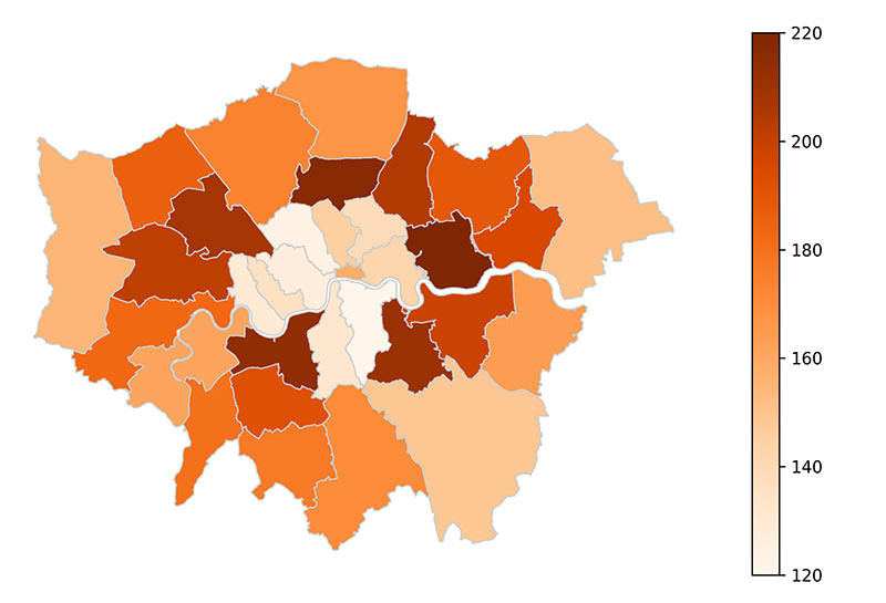
For example, a research problem involves the study of sales across different regions. Upon analysis, the insight identifies a certain region over-performing compared to the previous year but under-performing in the current year compared to other regions. Although the first data set may seem more appealing as a visual, the second data set depicts both the year-over-year (YOY) performance comparison for each region and the performance comparison between regions.
 |
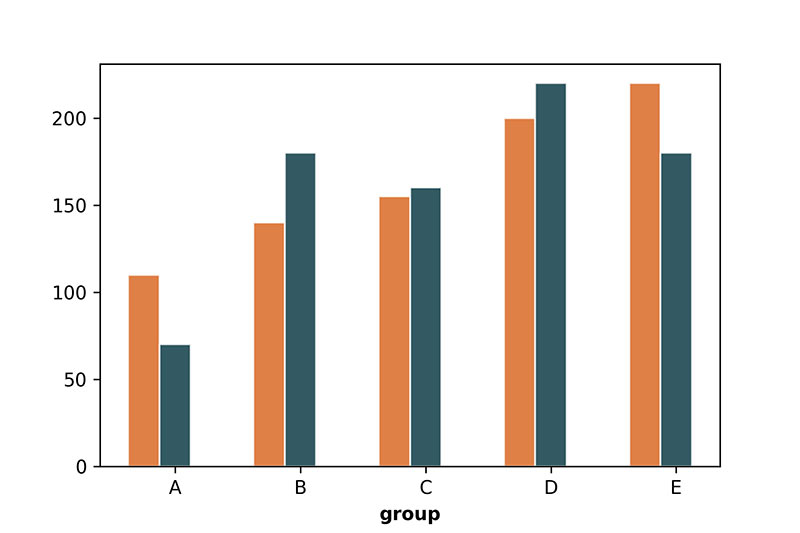 |
- Know your stakeholders: Knowledge about business stakeholders such as their interest areas, motivation, technical acumen, and availability, helps analyst determine the level of information to present. Analysts work with key stakeholders to identify the level of detail required and then determine what type of visual best meets that need.
For example, a stakeholder may want to understand a holistic metric; overall budget spend versus budget allocated. If there is no need to track the daily budget spend versus budget allocated, then representation of the aggregate metric through a percentage visual is more appropriate (similar to the second visual).

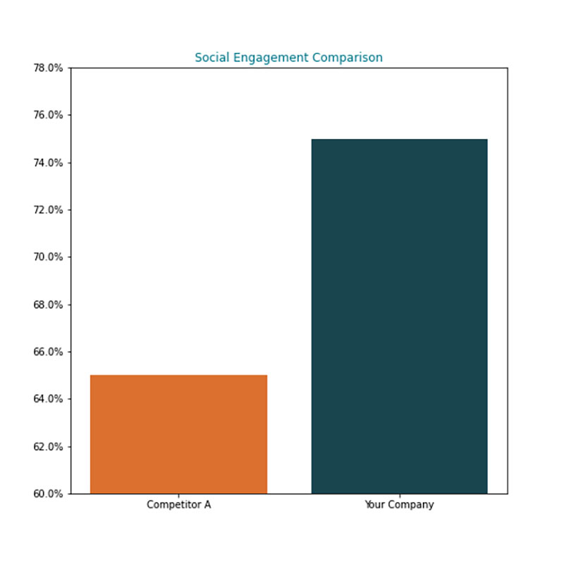
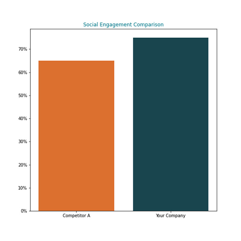
- Present unbiased analysis: Data can be inadvertently presented in a favourable light, to confirm the opinions of key stakeholders, or provide one's own opinion on what the representation may mean. The purpose of a business visual is to help stakeholders “see” the insight rather than direct stakeholders to a biased opinion.
For example, the graphs below show a simple example where the scale of the Y-axis is different although both graphs are presenting the same data. The audience may have a biased opinion if the first image is presented.
 |
 |
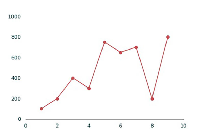
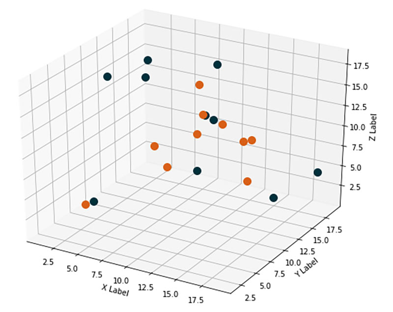
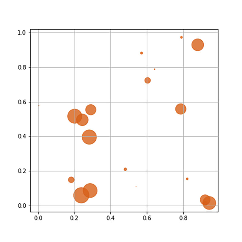
- Avoid complexity - function over form: With the advances in visualization tools and technologies, it is possible to produce visuals that are increasingly complex. However, simpler graphics are easier to understand and powerfully capture the insight. A visual which is highly appealing may not be the best option if a simpler alternative is available. Less context and instructions are needed to interpret a simpler graphic. Analysts should focus on the message rather than the aesthetics of a visual.
For example, both diagrams below introduce a third dimension to the data. It may be difficult to interpret the relative coordinates of the data points in the first image, whereas the second image can provide a clearer sense of the third dimension with the size of the data points.
 |
 |
- Stand out from the rest: When all other considerations such as the intent, the level of detail, and stakeholder preferences are equal between two visuals, it is advisable to have a visual stand out. Stakeholders can get fatigued by looking at similar visuals. Although the insight may be useful, the message may get lost, and this risk can be minimized by using a more unique visualization.
- The competencies required to create visualizations are shared between analysts, data science professionals, and user experience designers. It is helpful to collaborate with other practitioners to develop business visualizations that create a lasting impact.
3.2.3 Elements
.1 Purpose and Types of Visuals
The purpose of the visual plays a critical role in communicating the message, and the selection of the type of visual must suit this purpose.
Two questions can be used to understand the purpose of the visuals:
Selecting an appropriate visual depends on the type of data and the limitations that are associated with that data type. The type of data available and the way the data is required to be presented determines which types of visualizations are more suitable. The data may be used to present the following:
The visual is not always enough for stakeholders to “see” trends and patterns or draw insights. The context of the visual, the data element, key statistics, and legends are also explained. The story or the narrative establishes the context, whereas the key messages can be embedded into visuals without crowding the visuals.
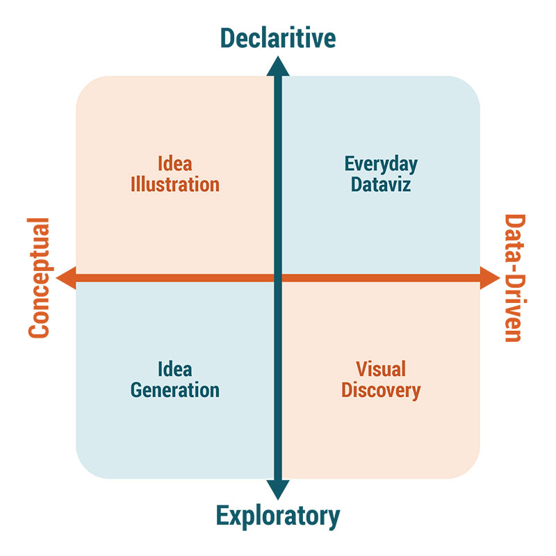
.1 Purpose and Types of Visuals
The purpose of the visual plays a critical role in communicating the message, and the selection of the type of visual must suit this purpose.
Two questions can be used to understand the purpose of the visuals:
- is the visual to be declarative or exploratory, and
- is the information in the visual going to be conceptual or data- driven?
- Idea illustration: requires decomposing complex ideas into simple, clear visuals that rely on the ability to understand metaphors and analogies. Gartner's Hype Cycle is a good example of this type of visual. Process models, infographics, and framework visuals are other examples that take a large amount of data and illustrate the idea in an intuitive way.
- Idea generation: helps during the discovery process. They include mental models, mind maps, conceptual metaphors, or simple objects that help you evolve your thinking.
- Everyday dataviz: are routinely used by business people and include bar charts and pie charts. The key is to simplify and focus on communicating single messages through each visual.
- Visual discovery: are the most complicated. They are primarily used to discover new insights and for visual confirmation of business hypotheses. Both data and exploration may require significant adjustments to different chart types to fit the purpose.
Selecting an appropriate visual depends on the type of data and the limitations that are associated with that data type. The type of data available and the way the data is required to be presented determines which types of visualizations are more suitable. The data may be used to present the following:
- Comparison: Compare two or more categories over time or by items or amounts. Bar charts, line charts, butterfly charts, among others are ideal.
- Composition: Show a whole that is composed of different items, for example, sales by different product lines or line of business. Stacked bar charts, waterfalls, and area charts are all good options.
- Distribution: Show distributions of different data elements or predictors. Line charts, histograms, and scatter plots are useful.
- Relationships: Illustrate relationships between data elements. Scatter plots, heat maps, chords, and venn diagrams can be used.
The visual is not always enough for stakeholders to “see” trends and patterns or draw insights. The context of the visual, the data element, key statistics, and legends are also explained. The story or the narrative establishes the context, whereas the key messages can be embedded into visuals without crowding the visuals.
3.2.4 Usage Considerations
.1 Strengths
.1 Strengths
- Business visualization is a powerful tool when combined with storytelling.
- Business visuals are much more effective in facilitating discussions and helping business stakeholders understand data insights.
- Business visuals can be used in various contexts which make them a versatile tool for interpreting and reporting results of analytics initiatives.
- Most stakeholders are familiar with using visuals to understand large amounts of data, so business visualizations can have a big impact with decision-makers.
- Business visualization may direct stakeholders to believe an incorrect conclusion that was a result of biased representation of the data.
- Visualizations require processing a large amount of data and are prone to data errors.
- Business visuals are mostly summaries, minor but relevant trends or facts may get overlooked.
- Data visualization requires strong storytelling and data orchestration skills which limits the use of standalone visuals.