
3. Techniques
3.18 Technical Visualizations
Guide to Business Data Analytics
3.18.1 Purpose
Technical visualizations are used by data scientists to evolve their analysis that becomes the detailed data for driving insights. They may not be useful for communicating insights to business stakeholders, but technical visualizations deepen the team's understanding.
Technical visualizations are used by data scientists to evolve their analysis that becomes the detailed data for driving insights. They may not be useful for communicating insights to business stakeholders, but technical visualizations deepen the team's understanding.
3.18.2 Description
Technical visualizations are a very specific set of data visualization techniques that are used by data scientists to understand data and drive insights. These visuals demonstrate insights that may be statistical or mathematical in nature, which allow data scientists to determine the optimal analytics approach and confirm modelling assumptions related to different types of analytics models.
Analysts are comfortable with common technical visualizations and understand the analysis performed by data scientists. They also simplify, translate, and communicate the impact of certain modelling assumptions or insights with stakeholders. While business visualizations mostly focus on one simplified message or impact related to the business, technical visualizations are focused on discerning data patterns.
3.18.3 Elements
The elements of each technical visualization differ based on the nature of the visualization. A common set of technical visualizations is presented here to demonstrate various technical visuals.
.1 Autocorrelation Plots (Box-Jenkins method)
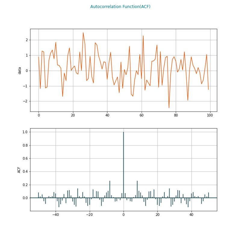 Auto-correlation plots investigate if outcomes are correlated to their historical values. They are especially important in time series analysis. Technically, the plot investigates the correlation of a function with the copy of the function from past periods.
Analysts may infer if the data generated for a time dependent distribution is dependent on its past values from an auto-correlation plot. The data randomly take a value if autocorrelation tends to zero. The top graph is an example of a series of values over time, and the bottom graph shows that there is a periodicity in how data behaves over time. Some of the common usages are understanding seasonality in data or examining stock prices and volatility.
.2 Box-Cox Plots/Normal Transformation
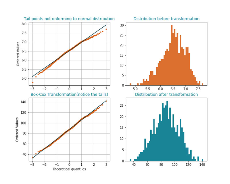 Many analytics models assume that the distribution of a predictor variable follows a normal distribution. Many models that have too much emphasis on sample data do not perform well when applied to new data. Based on context, data scientists may choose to rescale heavily skewed distributions (for example, distributions that are not symmetrical).
For example, some analytics problems require studying recommendations for a restaurant based on the number of reviews and star ratings. It is observed that many of the restaurants have a low number of reviewers. If there are 1 to 20 reviews for many restaurants and 2000 reviews for a few restaurants, the distribution of reviews is skewed. The data scientist may take an approach to remove these outliers (for example, 2000 reviews), but this may not be consistent with the business context. More reviews may mean a higher level of confidence that the restaurants' reviews are valid. In such cases the distribution requires a normal transformation. Analysts understand and propose the use of transformations based on the context of the problem.
.3 Contour Plots
Visualizing three-dimensional data is difficult. For example, colour coding is one method used if one of the variables takes a list of values represented by the colours. But if the variables take continuous values, visualizations are not adequate in explaining many properties. A contour map transposes the variable to a two-dimensional map with various levels of the third dimension presented as lines or rings.
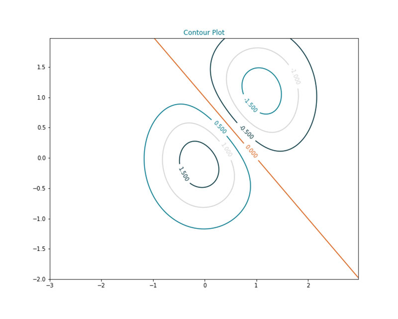 Contour maps are inspired from seismic data analysis. They can explain multiple aspects such as where the data density is high, exploring minimization or maximization problems, deep learning error functions, and gradient analysis.
.4 Correlation Map
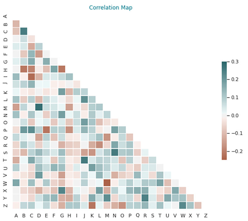
Correlation maps show pairwise correlations between two variables. In many analytics problems, the input data needs to be independent. For example, if a problem is about attrition analysis, there may be two variables that influence the probability of attrition, such as years of experience in an organization and the designation. If these two variables are considered two separate factors the probability is influenced by a combined, rather than the correct. Correlation maps describe this linear dependence by a number between -1 to 1.
Correlation maps are used heavily in analytics problems where models are built under the assumption of variable independence along with key statistical measures (for example, p values) to remove unwanted variables or features from a model.
p-value is the probability of observing a given data distribution or statistical result purely by chance when the null hypothesis is correcT.
.5 Principal Component Analysis (PCA) Plot
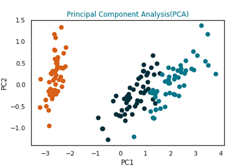
When multiple dimensions of data are involved in producing analytics results, the analytics models start to disintegrate. For example, the loss of predictive power of an analytics model. Current algorithms are quite capable of handling a few hundred variables but problems such as image or video processing generate variables with an order of magnitude that is far more than some algorithms can handle. For example, images are converted to pixels and each pixel reference may serve as a variable. Principal components are programmatically generated to simplify variables which impact the output variable the most.
Consider the following: the analytics problem refers to calculating the blue book value of a used car. The variables or predictors used to estimate the price of the car can include the manufacturer, model, colour, engine rating, number of doors, mileage, and odometer reading, where each can take on different values. Principal components (for example, referred as PC1, PC2 in the illustration) can be different groupings of cars with a similar range of values across these variables. PC1 represents a grouping that has the following characteristic: large engine, high fuel expenditure, high power, and PC2 is its converse. There are 3 distinct categories of cars to focus the analysis on. This pattern is difficult to visualize if all the variables had been considered. By grouping based on principal components, the problem can be solved more efficiently, faster, and with fewer resources.
Analysts are often required to interpret these principal components in business terms to communicate to stakeholders how the analytics model is built. For example, in clustering and market segmentation problems the principal components may describe different customer segments.
.6 Residual Plots
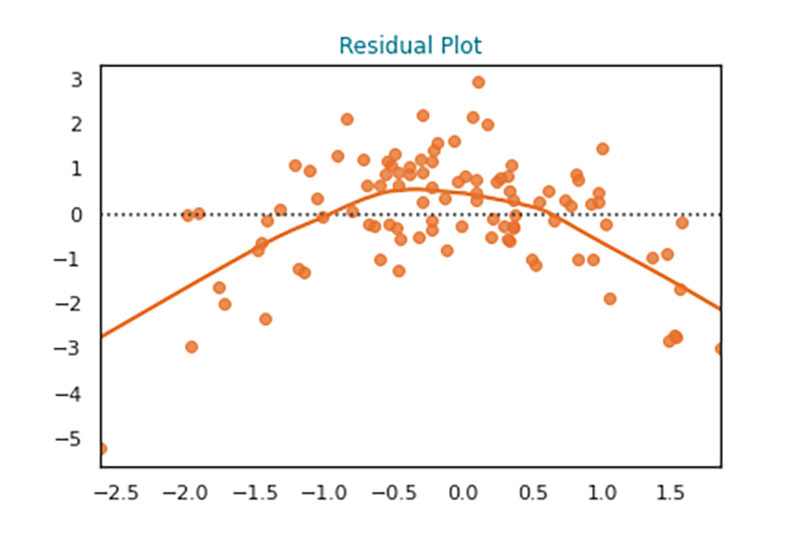
When linear models are used for predictions (for example. linear regression), the expected and actual values of the outcome may differ. The error produced may be plotted against a threshold value to analyze if there are any patterns to the errors. Specific patterns may indicate the goodness of the fitted analytical model. For example, analysts may infer that there is a non-linear relationship present for the output and the data (for example, inverted U in the image).
Similarly, some residual plots may indicate heteroskedasticity (for example, indicative of subgroups within data with different attributes), which may change the nature of the models used.
Similarly, analytical modelling parameters can be tuned (for example, hyperparameter tuning) by reviewing cumulative error plots for different hyperparameter combinations.
Heteroskedasticity refers to having error residuals that do not have a constant variance. It indicates that the data behaves differently across different ranges of values.
Hyperparameters of an analytical model or algorithm refers to the parameters that can be controlled to produce different results or control the learning process.
.7 Receiver Operating Characteristics (ROC) Curve
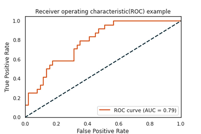
In many classification problems (for example, fraud detection), there are instances where traditional measures of performance are not adequate. The true positive rate (TPR) and false positive rate (FPR) can be manipulated by using a threshold parameter, thereby changing the evaluation criteria such as accuracy, precision, recall, and so on. This achieves the required level of trade-off between the evaluation parameters that is suitable for the classification problem.
The ROC curve plots the FPR and TPR on XY coordinates in a graph. The more area under the curve (AUC)) based on threshold values, the better the predictive model it is for a classification research problem.
The ROC may be used for establishing a baseline classifier (for example, classification model) and be compared against different classifiers. This helps data science professionals choose the appropriate algorithm to fine-tune further.
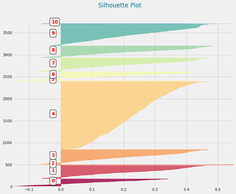
.8 Silhouette Plot
There are many applications of clustering problems in different business contexts, for example, market segmentation, news classification, object detection, crime hotspots detection, and natural language processing. The models developed for these applications are visually verified to ensure that the parameters used, such as number of clusters and the definition of similarity between observations, can produce the right result. The silhouette plot shows the results of clustering in a visual way. One silhouette map can contain a lot of information about the overall clustering model.
A silhouette plot usually depicts different clusters on the Y axis, and the length of silhouettes in the X axis is represented with a metric known as a silhouette score. The score varies between -1 to 1. A clear delineation of a cluster requires the silhouettes to be as wide and as long as possible in the plot.
For example, if the image were to depict different market segments based on customers and their buying patterns, the following insights can be deduced:
The elements of each technical visualization differ based on the nature of the visualization. A common set of technical visualizations is presented here to demonstrate various technical visuals.
.1 Autocorrelation Plots (Box-Jenkins method)
Auto-correlation plots investigate if outcomes are correlated to their historical values. They are especially important in time series analysis. Technically, the plot investigates the correlation of a function with the copy of the function from past periods.Analysts may infer if the data generated for a time dependent distribution is dependent on its past values from an auto-correlation plot. The data randomly take a value if autocorrelation tends to zero. The top graph is an example of a series of values over time, and the bottom graph shows that there is a periodicity in how data behaves over time. Some of the common usages are understanding seasonality in data or examining stock prices and volatility.
.2 Box-Cox Plots/Normal Transformation
For example, some analytics problems require studying recommendations for a restaurant based on the number of reviews and star ratings. It is observed that many of the restaurants have a low number of reviewers. If there are 1 to 20 reviews for many restaurants and 2000 reviews for a few restaurants, the distribution of reviews is skewed. The data scientist may take an approach to remove these outliers (for example, 2000 reviews), but this may not be consistent with the business context. More reviews may mean a higher level of confidence that the restaurants' reviews are valid. In such cases the distribution requires a normal transformation. Analysts understand and propose the use of transformations based on the context of the problem.
.3 Contour Plots
Visualizing three-dimensional data is difficult. For example, colour coding is one method used if one of the variables takes a list of values represented by the colours. But if the variables take continuous values, visualizations are not adequate in explaining many properties. A contour map transposes the variable to a two-dimensional map with various levels of the third dimension presented as lines or rings.
.4 Correlation Map
Correlation maps are used heavily in analytics problems where models are built under the assumption of variable independence along with key statistical measures (for example, p values) to remove unwanted variables or features from a model.
p-value is the probability of observing a given data distribution or statistical result purely by chance when the null hypothesis is correcT.
.5 Principal Component Analysis (PCA) Plot
Consider the following: the analytics problem refers to calculating the blue book value of a used car. The variables or predictors used to estimate the price of the car can include the manufacturer, model, colour, engine rating, number of doors, mileage, and odometer reading, where each can take on different values. Principal components (for example, referred as PC1, PC2 in the illustration) can be different groupings of cars with a similar range of values across these variables. PC1 represents a grouping that has the following characteristic: large engine, high fuel expenditure, high power, and PC2 is its converse. There are 3 distinct categories of cars to focus the analysis on. This pattern is difficult to visualize if all the variables had been considered. By grouping based on principal components, the problem can be solved more efficiently, faster, and with fewer resources.
Analysts are often required to interpret these principal components in business terms to communicate to stakeholders how the analytics model is built. For example, in clustering and market segmentation problems the principal components may describe different customer segments.
.6 Residual Plots
Similarly, some residual plots may indicate heteroskedasticity (for example, indicative of subgroups within data with different attributes), which may change the nature of the models used.
Similarly, analytical modelling parameters can be tuned (for example, hyperparameter tuning) by reviewing cumulative error plots for different hyperparameter combinations.
Heteroskedasticity refers to having error residuals that do not have a constant variance. It indicates that the data behaves differently across different ranges of values.
Hyperparameters of an analytical model or algorithm refers to the parameters that can be controlled to produce different results or control the learning process.
.7 Receiver Operating Characteristics (ROC) Curve
In many classification problems (for example, fraud detection), there are instances where traditional measures of performance are not adequate. The true positive rate (TPR) and false positive rate (FPR) can be manipulated by using a threshold parameter, thereby changing the evaluation criteria such as accuracy, precision, recall, and so on. This achieves the required level of trade-off between the evaluation parameters that is suitable for the classification problem.
The ROC curve plots the FPR and TPR on XY coordinates in a graph. The more area under the curve (AUC)) based on threshold values, the better the predictive model it is for a classification research problem.
The ROC may be used for establishing a baseline classifier (for example, classification model) and be compared against different classifiers. This helps data science professionals choose the appropriate algorithm to fine-tune further.
.8 Silhouette Plot
There are many applications of clustering problems in different business contexts, for example, market segmentation, news classification, object detection, crime hotspots detection, and natural language processing. The models developed for these applications are visually verified to ensure that the parameters used, such as number of clusters and the definition of similarity between observations, can produce the right result. The silhouette plot shows the results of clustering in a visual way. One silhouette map can contain a lot of information about the overall clustering model.
A silhouette plot usually depicts different clusters on the Y axis, and the length of silhouettes in the X axis is represented with a metric known as a silhouette score. The score varies between -1 to 1. A clear delineation of a cluster requires the silhouettes to be as wide and as long as possible in the plot.
For example, if the image were to depict different market segments based on customers and their buying patterns, the following insights can be deduced:
- Although the number of segments chosen is 10, there are only four to five dominant clusters or customer segments. Analysts might reduce the number of clusters in the analytics model.
- The cluster number 4 has a very narrow silhouette compared to its width. This may be reducing the average length of the silhouettes. It may indicate that this cluster could be broken up in to more homogeneous segments.
- There are some clusters with negative starting range. For example, cluster 0, 5. These two clusters also have narrow silhouette. This further suggests that these clusters can be removed from analysis resulting in smaller number of market segment.
3.18.4 Usage Considerations
.1 Strengths
.1 Strengths
- Collectively, most technical visuals provide insights related to the analysis process, such as model selection, modelling assumptions, and model fits, that increase the performance of analytical models and reduce the time taken to develop these models.
- Most technical visualizations are well-defined and discussed for different types of analytics problems, which allows a systematic analytics approach to be developed.
- Technical visualizations can communicate how and why some of the analytical modelling choices are made. Without visualizations, the rationale for these choices can be lost for stakeholders.
- There are several tools and techniques at the disposal of data science professionals and analysts to create standard visuals.
- Interpretation of technical visuals may be challenging without the necessary technical foundation in the subject matter.
- The interpretations made by a data team due to the technical visuals may bias the analytical models, which may not be consistent with the business context, because they are built only on the available data.
- Technical visuals need to be bolstered with business and domain knowledge, which is difficult to translate into empirical rules used in the interpretation of technical visuals